02 / Design studies03 selected works
Visualsystems.
Three projects where concept, hierarchy and repeatable visual decisions lead the final outcome.
Scroll to explore ↓Design thinkingView the decisions+
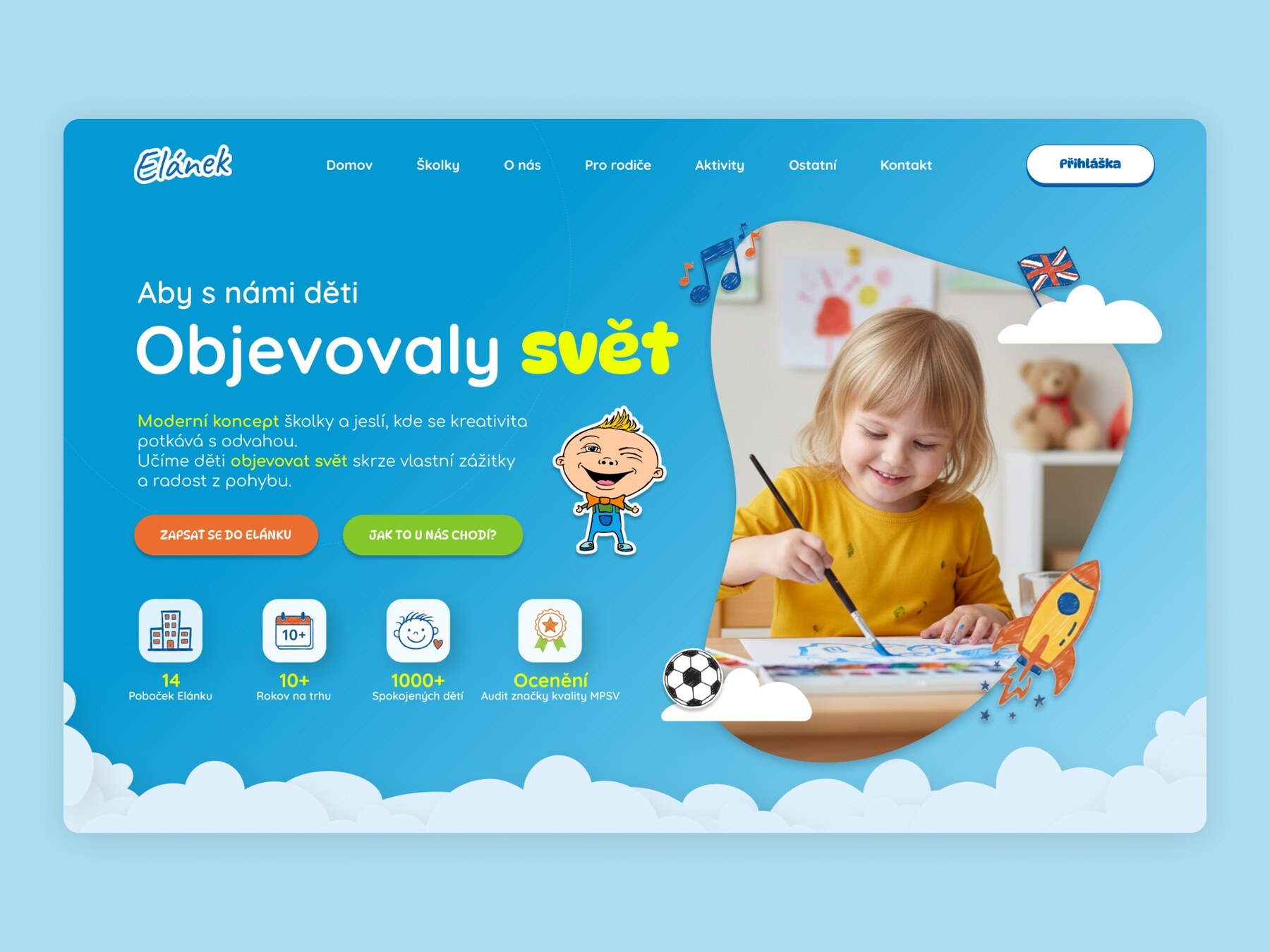
01 / ChallengeTurn a large kindergarten network into a landing page that feels playful to children, trustworthy to parents and effortless to scan.
02 / ApproachI shaped the first screen around a parent's decision journey: a clear promise, immediate proof and a direct path to enrolment.
03 / Key decisions- A strong blue canvas creates one recognisable world.
- Yellow type and illustrated details add energy without weakening the hierarchy.
- Trust signals and key numbers appear in the first viewport.
04 / OutcomeA warm, conversion-focused hero that balances emotion, orientation and credibility.
Design thinkingView the decisions+
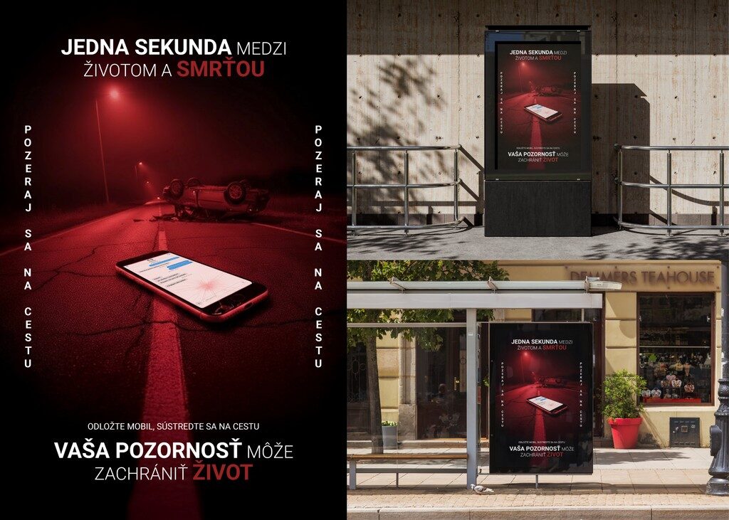
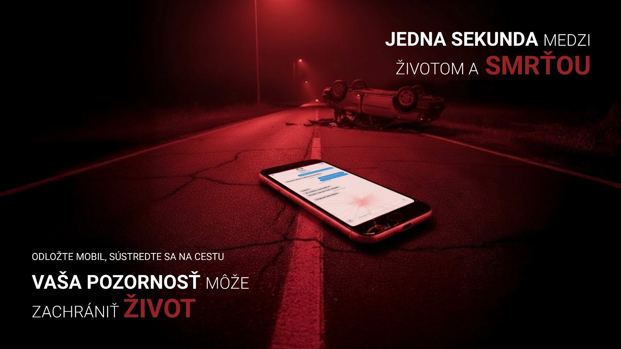
01 / ChallengeCommunicate the danger of using a phone while driving in a way that can be understood within seconds and still leaves an emotional trace.
02 / ApproachI built the campaign around a single frozen consequence: the message on the phone, the crashed car in the distance and one dominant red visual world.
03 / Key decisions- The phone sits closest to the viewer so distraction becomes the immediate entry point.
- Red light and a restrained palette create urgency without adding visual noise.
- The line is split into a clear cause-and-consequence hierarchy for fast outdoor reading.
04 / OutcomeA flexible campaign system that keeps the warning legible across portrait posters, city-light placements and a wide billboard.
Design thinkingView the decisions+
01 / ChallengeTranslate an abstract idea into a digital experience with a clear point of view, without making the interface difficult to follow.
02 / ApproachI started with the narrative and built a visual system around hierarchy, rhythm and contrast so experimental moments still feel intentional.
03 / Key decisions- Typography carries the concept instead of acting as decoration.
- Scale creates momentum and guides the order of reading.
- A disciplined grid keeps expressive elements coherent across screens.
04 / OutcomeAn interactive prototype where concept and usability support each other rather than compete.
More
systems.
Design thinkingWhy it works+
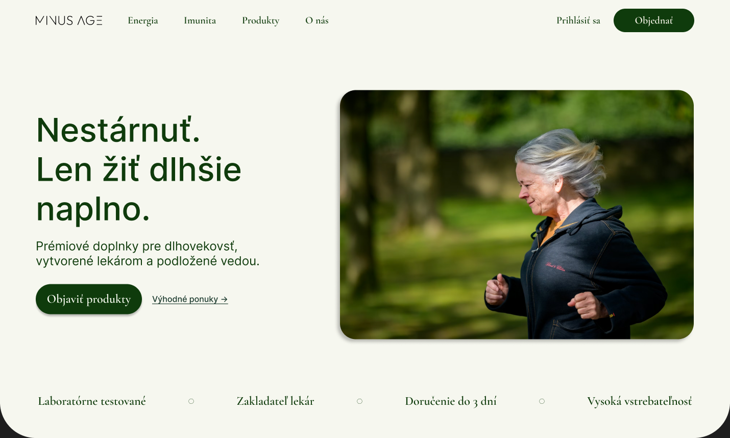
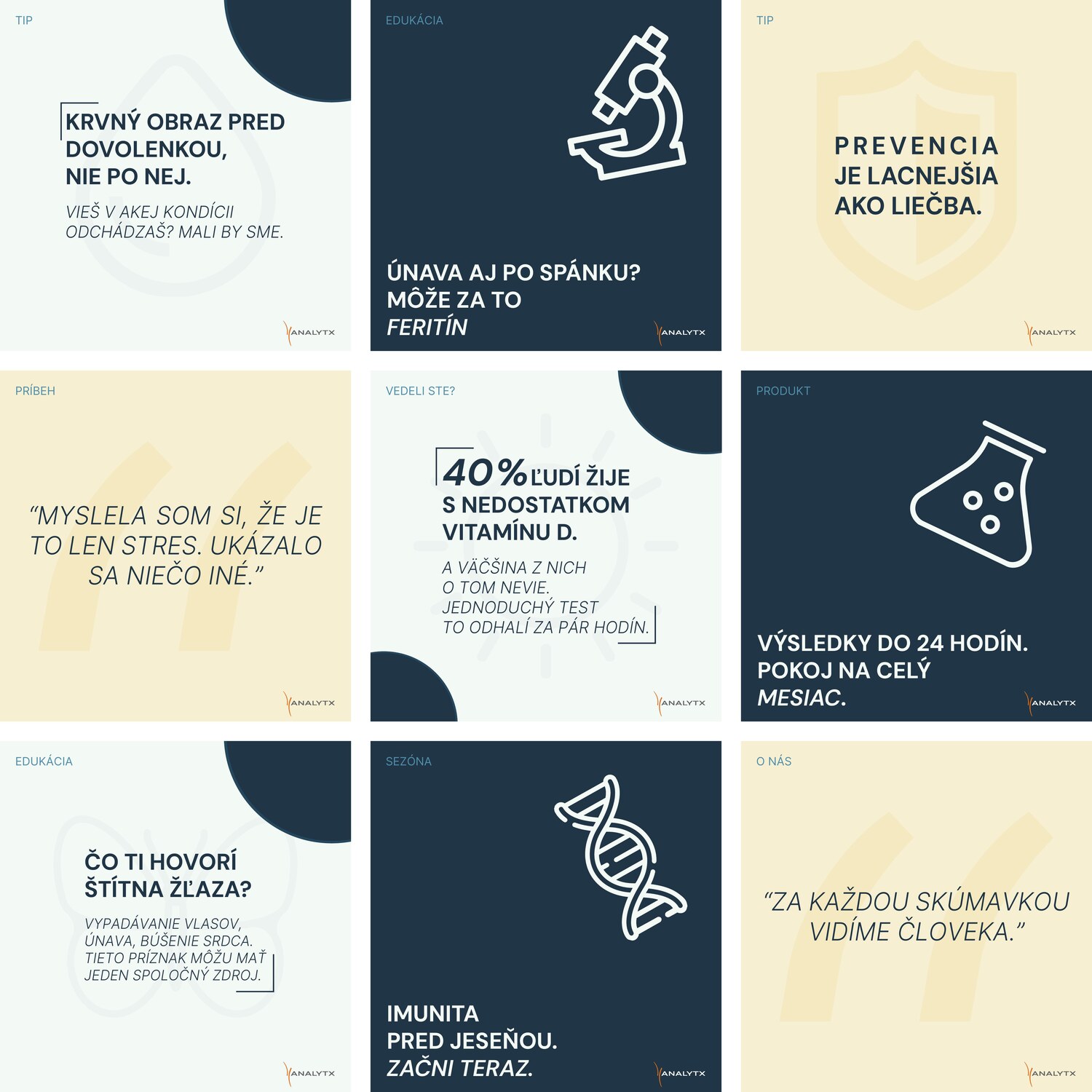
01 / ChallengeMake medical information approachable in individual posts while keeping the complete feed credible and recognisable.
02 / ApproachI designed a modular content system instead of isolated visuals, giving education, prevention and product communication a shared structure.
03 / Key decisions- A clear headline hierarchy keeps every post readable on mobile.
- Repeatable templates make future content faster to produce.
- Controlled colour and image treatment balance clinical trust with a human tone.
04 / OutcomeA scalable social feed that stays coherent as topics, formats and campaign needs change.
Design thinkingWhy it works+
01 / ChallengeMake a creative agency instantly recognisable from the road without relying on generic marketing language or an overloaded layout.
02 / ApproachI treated the billboard as a copy-first campaign: one sharp line, one unmistakable blue world and enough space for the idea to land at speed.
03 / Key decisions- One message per placement keeps the campaign readable in a few seconds.
- High-contrast white typography makes the line work from distance.
- A repeatable grid and colour system let the personality carry across formats.
04 / OutcomeA direct outdoor system that feels confident, memorable and distinctly Vizart while remaining practical for multiple placements.